# justdraw.fyi — full text
> A vector editor in the browser that an AI agent can actually drive. Every drawing is a URL. No account, nothing to install. The editor's buttons, the `jd` command line and an AI agent all send the same JSON commands, so an agent's edit is undoable, autosaved and rendered exactly like a human's.
Source: https://www.justdraw.fyi/
The app: https://app.justdraw.fyi/
Machine-readable index: https://www.justdraw.fyi/llms.txt
---
# Tool: Outline View
Published: 2026-07-13
URL: https://www.justdraw.fyi/posts/tool-outline-view/
A drawing has two lives. There is the picture — the thing you and everybody else
sees, made of filled colour. And there is the geometry — the paths, the anchors,
the actual objects the document is made of.
Most of the time, looking at the picture tells you the truth about the geometry.
Occasionally it doesn't, and those occasions are maddening precisely because
everything looks fine.
Some examples, all of which have cost me an hour at some point.
A shape you thought you deleted is still there, exactly behind another shape of
the same colour. Invisible. It moves when you box-select, it exports, it inflates
the file, and there is nothing on screen to tell you it exists.
A path you thought was closed isn't. It has a gap of a fraction of a pixel where
the two ends nearly meet, and the fill renders anyway — quietly bridging the gap,
because the renderer will happily close a nearly-closed path to fill it. It looks
perfect. Then you export to SVG, or hand it to a plotter, or try to use it in a
boolean operation, and the gap turns out to have been real all along.
Two shapes are stacked with a hairline of one poking out from behind the other,
and it reads as a deliberate outline rather than a mistake, so you never question
it.
A shape has been duplicated in place. There are now two of everything. Every
subsequent edit you make touches one of them.
In every one of these cases, the picture is telling you a story about the
geometry that is not true. The fill is doing what fills do — covering things up.
That is its job, and it is very good at it, and it is precisely what you don't
want when you're trying to find out what's actually in your document.
Outline view turns the fills off. Every shape becomes a thin wireframe of its own
path, and the drawing becomes the geometry rather than the picture. The hidden
duplicate appears, because now there's a stray outline where nothing should be.
The open path appears, because you can see the gap. The shape stacked behind
another appears, because there's nothing to hide behind any more.
The same drawing, twice. On the left, what the fills let you see. On
the right, what is actually in the document — every edge, including the ones
that were behind something.
It's the toolbar's diagnostic instrument. Nothing else in the editor tells you
what's *really* there.
The reason I think this deserves an essay rather than a tooltip is that the
underlying situation is completely general, and once you have the concept you
start seeing it everywhere. You are working with a system that has a
representation and a rendering, and you spend nearly all your time looking at the
rendering, because that's what you're making. But you are *editing* the
representation. And every so often those two things drift apart — the rendering
looks right for a reason that has nothing to do with the representation being
right — and when that happens, no amount of staring at the rendering will help
you. You have to look at the other thing.
That's what a debugger is. That's what "view source" is. That's what an X-ray is.
The value of the tool is not that it shows you something prettier; it's that it
shows you something *different*, and the difference between the two views is
exactly where your bug is. [1]
So the practical advice: when a drawing is behaving strangely — a selection
grabbing things you didn't expect, an export coming out wrong, a boolean
operation refusing, a file mysteriously heavy — don't stare harder at the picture.
The picture has already told you everything it knows, and it may well be lying.
Flip to outline and look at the truth.
Most of the time it takes about four seconds to see what's wrong. There is a
stray path. There is a gap. There are two of them. [2]
[1] The reason it's satisfying is that it converts an invisible problem into a
visible one, and visible problems are easy. Almost all of the difficulty in
debugging anything is in the conversion, not in the fix.
[2] The second-best diagnostic is to select everything and read the count. If you
believe there are nine shapes and the editor believes there are eleven, you have
learned something important without looking at anything at all.
---
# Tool: The Parametric Shapes
Published: 2026-07-11
URL: https://www.justdraw.fyi/posts/tool-the-parametric-shapes/
Is a triangle a polygon with three sides?
Yes, obviously. And the fact that it's obvious is why there is a separate triangle
tool in this editor, which I added because an AI agent got it wrong and, in
getting it wrong, showed me that I would have got it wrong too.
Here's the story. I asked an agent to draw a house. It drew a square for the
walls, which was right, and then it needed a roof. Reaching for a triangle, and
finding a `polygon` primitive that takes a number of sides, it did the sensible
thing and asked for a polygon with three sides, bounded by a box sitting on top of
the square.
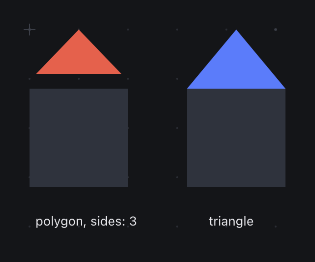
What it got was a triangle whose base floated above the square, with a gap of
daylight underneath, and whose peak didn't touch the top of its box either.
Both roofs were asked for the same box. On the left, a polygon with
three sides; on the right, the triangle primitive. Neither shape is wrong — but
only one of them is a roof.
Nothing was broken. A regular polygon with N sides is defined as inscribed in a
circle — every vertex on the circumference, evenly spaced. That's what makes a
hexagon a hexagon and a pentagon a pentagon, and it is what you want for every
value of N you are likely to ask for. But run N=3 and look at what inscribed
means: one vertex at the top of the circle, two more at 120° around it. Those two
lower vertices sit at the circle's widest points, which is *above* the bottom of
the box. The base of an inscribed triangle does not touch the bottom edge of its
bounding box. It cannot. The bottom of the box is tangent to the circle at a
single point, and that point is halfway along the base, and there is no vertex
there.
So the polygon tool was correct, and the agent's reasoning was correct, and the
result was a roof with a draught.
The lesson is that "a triangle is a polygon with three sides" is true in geometry
and false in drawing. When a person says triangle, they don't mean the inscribed
regular 3-gon. They mean the thing with a flat base that fills its box — base on
the bottom, apex at the top, corners in the corners. That's the roof. That's the
play button. That's the arrowhead. It is not a special case of the polygon; it's a
different shape that happens to share a vertex count.
So there's a triangle tool, on T, and it does what people mean.
I find this a genuinely instructive kind of bug, because it's the sort that can't
be caught by testing what you built. Both shapes were exactly right by their own
definitions. The error lived in the assumption that a user reaching for "three
sides" wants the mathematician's object rather than the builder's, and the only
way I found out was by handing the tool to something that had never seen it, that
read the parameter list literally, and that had no folklore telling it which
primitive was really meant for roofs. [1]
The rest of the parametric shapes are what they sound like, and they earn their
place by being parametric — you don't draw them, you state them, and then you can
restate them.
Polygon takes a side count. Star takes a point count. Spiral winds. Grid gives you
a rectangular or polar lattice as one object rather than forty lines you have to
keep aligned. Flare is a starburst. Each is a shape whose definition is a couple
of numbers, and drawing them by hand would mean doing arithmetic with a pen —
placing ten points of a star at exactly 36° intervals, by eye, and then living
with the one that's a degree out.
That's the argument for a parametric primitive: not that it saves you time, but
that it saves you *precision you would otherwise have to fake*. A star drawn by
hand is a star that is slightly wrong in a way you can see but can't locate. A
star with a point count is symmetric by construction.
The moment any of them stops being enough — you want one arm of the star longer,
you want the spiral to pinch — the escape hatch is to treat it as geometry: cut
it, reshape it, carve it with Shape Builder. The parametric shape is a good
starting point, not a cage. [2]
[1] The general form of this is worth carrying around: your users' folklore is
invisible to you, because you have it too. Anything that "everyone knows" about
your tool is undocumented, and the fastest way to find it is to hand the tool to
something that knows nothing and watch which of its perfectly reasonable
assumptions blow up.
[2] `circle` is a related sleight of hand. You can ask for one, and what you get
back reports its type as `ellipse`, because a circle is an ellipse with equal
axes and there's no reason for the document to carry two shapes where one will
do. The briefing tells agents this explicitly, because the first one to see it
assumed it had been given the wrong shape and drew another.
---
# Tool: Layers and Groups
Published: 2026-07-10
URL: https://www.justdraw.fyi/posts/tool-layers-and-groups/
A group is a promise. It says: these five shapes are one thing now, and from here
on you may treat them as one thing.
Almost everything about groups follows from taking that promise seriously, and
the most instructive bug I have shipped came from not taking it seriously enough.
Here is what happened. I gave an AI agent a link to a project and asked it to lay
out a logo — a mark and a wordmark, side by side, vertically centred against each
other. The mark was seven shapes: a circle, some bars, a couple of carved
negative spaces. Sensibly, the agent grouped those seven into one object first.
Then it asked to vertically centre the group against the wordmark.
And the composition exploded.
Every one of the seven shapes centred itself individually against the wordmark.
They all piled up on the same horizontal axis, on top of each other, and the mark
— which had taken twenty commands to build — was gone. Not corrupted, exactly.
Each shape had done precisely what it was told. The result was a heap.
My first instinct was that the agent had made a mistake, and I sat down to write
a line in the documentation explaining that you should ungroup before aligning.
Which is, on reflection, an insane sentence. It says: our grouping feature is a
trap, and here is the ritual for avoiding it.
The agent hadn't made a mistake. It had believed the promise. It grouped seven
shapes into one thing, and then it asked the one thing to move, and we atomized
it. The bug was ours, and it had been sitting there in the human UI too — select a
group, hit align, watch your composition detonate — where it had presumably been
annoying people who assumed they'd done something wrong. [1]
The fix is a function called `units()`. Before an align or a distribute runs, it
resolves the selection into *units*: a loose shape is a unit, and a group is a
unit — one unit, with one bounding box, computed across everything inside it.
Then the operation runs on units. A group's bounding box moves, and everything
inside travels with it, rigidly, keeping every internal relationship exactly as it
was.
Which is what every design tool does, and what any person would expect, and what
the word "group" plainly means. We just hadn't implemented the meaning. We'd
implemented a list.
The mark is a group of three shapes, vertically centred against the
wordmark. It travels as one rigid piece: the bars inside it never move relative
to the circle. Before units(), this operation centred all three
shapes individually and destroyed the mark.
That's the general shape of the lesson, and it's the reason this post exists.
There is what a group *is in the data* — a node with children, a container, a
list of ids. And there is what a group *means to the person* — one thing. Those
are not the same, and the gap between them is where bugs of this class live.
Whenever an operation reaches into a group and touches the children individually,
ask whether it should have been talking to the parent. Usually it should.
Layers are the same idea pointed at a different axis. A group is about which
things belong together. A layer is about what is in front of what — the stacking
order, plus the ability to lock or hide an entire stratum of the drawing at once.
The reason both exist is that "these things are one object" and "these things are
at the same depth" are genuinely different claims, and a program that conflates
them will make you choose between organising your artwork and organising your
z-order.
Groups nest, so a mark can be a group of a group. Order (front, back, forward,
backward) works on the same units — sending a group backward sends the whole
group backward, as a slab, rather than interleaving its members with whatever
they land among.
And the CLI and the agent API get all of this for free, because they don't
implement alignment. They send `arrange.align` to the editor, and the editor is
the only thing in the system that knows what alignment means. Fix `units()` once
and the button, the keyboard shortcut, the shell command and the AI all become
correct in the same commit. That is the entire argument for having one
implementation, and I would not have believed it as strongly if I hadn't watched
the alternative destroy a logo. [2]
[1] I never got a bug report about this from a human. I think people assumed they
had mis-clicked, undid it, and quietly formed the habit of ungrouping first. A
superstition instead of a complaint. It took a machine — which has no pride, and
no habit of blaming itself — to do the obvious thing and reveal that the obvious
thing was broken.
[2] The other half of the fix was documentation: the briefing now tells an agent
to group what belongs together, precisely *because* a group aligns as one piece.
The behaviour became something you can rely on, so the docs can now recommend
relying on it.
---
# Tool: Artboards
Published: 2026-07-09
URL: https://www.justdraw.fyi/posts/tool-artboards/
Open almost any drawing program and the first thing you are given is a page.
It sits there in the middle of the screen, white, rectangular, with an edge. You
did not ask for it. You have not said what you are making or whether it will ever
be printed, and already the software has decided that your work has a boundary,
that the boundary is a rectangle, and — if you look at the default — that the
rectangle is the size of a sheet of paper used by office printers in your
country.
That page is a fossil. It's there because the first drawing programs were built
to produce printed output, and a printed thing has a physical edge, and so the
edge went into the software. Every reason for it has since evaporated. Most
drawings made today are never printed. They're an icon, a diagram in a document,
a slide, a sketch pasted into a chat window. And yet the page persists, because
it is very hard to remove a default that everybody has stopped noticing. [1]
So: this canvas is infinite. There is no page. Shapes go where you put them,
negative coordinates are fine, you pan and you keep going, and nothing has an edge
until you say it does.
That's the right default, because it's the honest one — at the moment you start
drawing, you usually don't know how big the thing is. Deciding the boundary first
is deciding the least knowable thing first. You end up either cramped, drawing
smaller than you want because you can see the wall, or wasteful, sizing the page
generously and then living with a lot of white space you have to remember to
crop.
But you do, eventually, need an edge. Not to draw inside, but to *export*. At the
point where a drawing has to leave the program and become a PNG, something has to
say where it stops.
That's what an artboard is. You take the Artboard tool, you drag a rectangle
around whatever region matters, and you've defined an export region. It doesn't
constrain your drawing. Shapes can hang over its edge, sit outside it entirely,
overlap several artboards at once. It has no opinion about your composition. It
is a statement about framing, made at the end, when you actually know what the
frame should be.
And you can have as many as you like, over the same artwork. One artboard tight
around the logo mark. Another around the mark plus the wordmark. A third, square,
around the mark with generous padding, because that's what the avatar upload
wants. All three are views of the same geometry, all exportable, none of them
"the page."
That is the thing a page cannot do. A page is one frame, chosen first, and
everything else is a crop. Artboards are many frames, chosen last, and none of
them is privileged.
The order is the whole argument. Page-first software asks you to commit to the
boundary before you know the content. Artboards let the content settle and then
ask where you'd like to cut it — which is the order that every other visual craft
uses. A photographer doesn't choose the crop before the shot. A painter doesn't
pick the frame before the picture. [2]
One small thing, which I mention because it bothered me enough to fix. An
artboard is not selectable artwork — it isn't a shape, it has no fill, it doesn't
appear in the Layers panel with the things you drew. Which meant that when you
dragged one out, it appeared and then... nothing. No selection, no highlight, no
row lighting up anywhere. The most common reaction was to drag out a second one,
because you weren't sure the first had worked.
So now a freshly dropped artboard flashes: its region lights up and its row in
the inspector highlights and scrolls into view, for about a second and a half.
Nothing about the document changed. It just says *I heard you*, which is the
least a tool can do and, it turns out, exactly what was missing.
[1] The page is not the only fossil in graphics software. The floppy disk save
icon is the famous one. My favourite is that many programs still measure type in
points, a unit defined by the physical size of metal sorts in a printer's case.
[2] There is a real cost to the infinite canvas, and it's disorientation — no
edge means no landmark, and it's possible to pan off into empty space and lose
your drawing entirely. Zoom-to-fit and the artboard list are the compass. If you
find yourself lost, the answer is almost always to press 0.
---
# Tool: The Two Erasers
Published: 2026-07-08
URL: https://www.justdraw.fyi/posts/tool-the-two-erasers/
There are two erasers in the toolbar, and for a while I thought that was a
mistake I would eventually get around to fixing.
It isn't. They do different things, and the reason they have to is one of the
oldest confusions in vector drawing — a confusion the pixel world simply doesn't
have.
In a paint program, an eraser is unambiguous. There is one kind of thing on the
canvas, pixels, and the eraser removes them. Drag it anywhere and the pixels
under it go away. Nobody has ever had to ask what an eraser does.
In a vector program, there are two completely different kinds of thing on the
canvas, and they only look alike. There is a **filled region** — a rectangle, a
disc, the closed silhouette of a letter, an area with an inside. And there is a
**stroke** — a line, an arc, a pen path, a thing with length but no inside, that
is visible because it has been painted along.
An eraser dragged across a filled disc should take a bite out of it, leaving a
disc with a scoop missing. An eraser dragged across a line should not take a bite
out of the line. It should shorten it. The line has no interior for a bite to be
taken out of; what you obviously want is for the part you rubbed to stop existing
and the rest to remain.
Those are different operations. Not different in degree — different in kind. One
subtracts area, and the other trims length. And because a vector drawing contains
both kinds of object at once, a single eraser cannot be right; it would have to
guess which one you meant, and it would guess wrong about half the time, and you
would slowly come to distrust it.
So: the **Eraser** cuts shapes. Drag it across filled regions and it removes the
area you dragged over, reshaping the outline to go around the bite. The disc comes
out with a scoop.
And the **Path Eraser** trims paths. Drag it along a path and the part you dragged
over is deleted, and the path ends where you stopped. The line gets shorter.
Once you can name the two kinds of object, the two tools stop being confusing and
start being obvious. Which is, I think, the actual lesson here, and it's not
really about erasers.
Almost every persistent confusion in a piece of software is a place where two
different things have been given the same name, or the same appearance, or the
same button. The user's difficulty is a symptom; the underlying disease is that a
distinction the program depends on was never made visible. People are not confused
because they are careless. They are confused because they have correctly noticed
that the system is telling them two things at once. [1]
The honest fix is not to merge the tools into one clever eraser that guesses. It's
to make the distinction legible — to name both things, put both in the toolbar,
and let the person who understands the difference act on it. That costs a
sentence of explanation, once, and then it never costs anything again. The clever
merged version costs a little bit of trust every day, forever.
There is a third tool nearby that is not an eraser at all and gets used as one,
which is Shape Builder with alt held down. That removes a *face* — a region
bounded by the shapes you already drew. If the area you want gone happens to be
enclosed by existing geometry, alt-drag is better than the eraser, because the
resulting edge is exactly the edge of the shape that was already there, rather
than the wobble of your hand. Use the eraser when you want a hand-made edge, and
Shape Builder when you want a geometric one. [2]
[1] The tell is when experienced users develop a superstition — "don't use the
eraser on lines, it does something weird" — instead of a rule. A superstition
means the distinction is real and undocumented, and everyone has independently
discovered its shadow.
[2] I use alt-drag ten times for every one time I use the eraser, which is
probably true of anybody who draws with geometry rather than by hand. The eraser
earns its place for the cases where you want the mark to look made rather than
computed.
---
# Tool: Knife and Scissors
Published: 2026-07-07
URL: https://www.justdraw.fyi/posts/tool-knife-and-scissors/
Why does the toolbar have two tools for cutting?
It looks like an oversight — the kind of duplication that accumulates in software
when two people implement the same idea in different years and nobody has the
authority to delete one. It isn't. Scissors and Knife do genuinely different
things, and the difference is one of the more useful distinctions in the whole
toolbar once you can see it.
Scissors cuts at a point. You click on a path, on a specific spot, and the path
is split there. One path becomes two, joined nowhere, each now selectable and
movable on its own. Nothing else in the drawing is affected. It's a surgical cut
with a stated location, and the location is where you clicked.
Knife cuts along a line. You drag across the canvas, and everything your drag
passes through is sliced — not at one point, but along the whole stroke, and not
just the path you were aiming at, but every path that happened to be in the way.
It's a cleaver, not a scalpel.
Once you have that, the choice is obvious in every real situation. If you want to
open a closed shape so you can pull one side of it away — click, Scissors. If you
want to take a rectangle and end up with two triangles — drag a diagonal, Knife.
If you want to trim the tail off a line — Scissors at the point where the tail
starts, then delete. If you want to cut a whole cluster of overlapping shapes
along one straight edge, as though you had laid a ruler over them and drawn a
blade down it — Knife, once, and every one of them opens along the same line.
That last case is the one that shows why the difference matters. Doing it with
Scissors would mean clicking each path twice, on each side, and getting the
positions to agree with each other by eye. Doing it with Knife is one gesture,
and the cuts agree by construction because they are all the same cut.
Here's the underlying distinction, and it's a general one worth carrying around:
Scissors takes a **point** as its argument, and Knife takes a **path**. Everything
that follows — the surgical/cleaver feel, the affects-one-thing/affects-everything
behaviour — falls out of that. When you know what a tool takes, you know what it's
for. [1]
There's a second, quieter thing about Knife that took me a while to appreciate.
It cuts through *everything* in its path, and that is a feature, not a hazard,
because it means the cuts line up. If you slice four stacked shapes with one
drag, the four resulting edges are collinear — perfectly, not approximately. You
could not achieve that by hand in any amount of time, and it is exactly what you
want when you're cutting a composition apart to reveal a layer beneath, or
splitting a wordmark along a diagonal so the halves can slide.
The hazard is real too, of course, which is that Knife will happily cut things you
had forgotten were under the cursor. Lock a layer you don't want touched, or zoom
in so your drag is short. [2]
Both tools leave you with paths, not fragments of some new type. That sounds
obvious and it is the thing that makes them composable: cut a shape in half, then
reshape one half, then smooth it, then give it a width profile. A cut isn't a
special state. It's just a document with more paths in it than before.
And if what you actually wanted was to remove a region rather than divide one,
you don't want either of these. You want Shape Builder, alt-dragging the face
away, or one of the erasers — which are their own confusion, and their own post.
[1] The same lens explains most of the toolbar. Curvature takes points. Reshape
takes a region. Width takes a point on a path plus a magnitude. Shape Builder
takes a drag across faces. A tool is mostly defined by the shape of the argument
it accepts, and its behaviour is mostly the consequence.
[2] Knife also does not care about your feelings regarding groups, which is the
kind of sentence you write after losing a composition to a careless drag.
---
# Tool: Width
Published: 2026-07-05
URL: https://www.justdraw.fyi/posts/tool-width/
Look at any handwritten letter, any brush stroke, any line drawn by a person with
an actual implement, and measure its thickness at both ends. It won't match.
It can't match. A pen nib held at an angle lays down a wide mark when it travels
across the grain and a narrow one when it travels along it. A brush is fat where
it's pressed and thin where it's lifted. A pencil thickens as the hand bears down
on a confident stroke and tapers as it releases. Thickness varies because a line
is made by a physical thing being dragged across another physical thing, and
those things push on each other by different amounts at different moments.
Now look at a line drawn by a computer. It is exactly two pixels wide from
beginning to end. It was two pixels wide at the start, it was two pixels wide
through the corner, and it was two pixels wide when it stopped. It is the
straight-line graph of a quantity that never changed, which is a strange thing to
put in a drawing, and it is the default everywhere, and we have all stopped
seeing it.
That is what the Width tool is for. You drag on a stroke and you change its
thickness at that point, and only near that point. Do it in a couple of places
and the stroke swells and tapers along its length: thick through the belly of a
curve, thinning as it runs out toward a terminal.
The effect is out of all proportion to the effort. A logo drawn with constant
strokes looks like a diagram. The same logo with even a little width variation
looks *drawn*, and people can't usually tell you why — they just say the second
one looks better, or more expensive, or more finished. What they're responding to
is the ghost of a hand.
There's a reason this is worth understanding rather than just using. Every
typeface you have ever read is built on it. The reason a serif letter has thick
strokes and thin ones is not decoration; it is the fossil of a broad-nib pen held
at a consistent angle, a physical fact from a thousand years ago preserved in
outlines that no pen has touched in centuries. Even a geometric sans-serif, which
is supposed to have uniform strokes, quietly doesn't: where the round of an `o`
meets its sides, the curve is thinned, because if it weren't, the joint would
read as a dark blot to the eye. The designer put a variation in to defeat an
optical effect that only exists in your head.
Uniform width isn't neutral. It's a choice, and it usually reads as machinery. [1]
The mechanic here is worth a sentence, because it's what makes the tool feel
direct. A stroke's width in this editor is not one number; it's a profile — a set
of widths at points along the path. Dragging with the Width tool adds a point to
that profile and sets its value, and the widths in between are interpolated, so
the change eases in and out instead of stepping. Which means you are not editing
a parameter of the line. You are editing the line, in the place you are pointing
at, which is the same principle as Reshape one layer down: act on the region you
can see, not on the abstraction that produced it.
And it is still a vector. The stroke isn't rasterized into a filled blob you can
no longer adjust; the profile lives on the path, so you can go back a week later
and thin it out. Everything else — moving anchors, reshaping, smoothing — keeps
working. Width is a property of the stroke, not a destructive commitment.
Use it sparingly. The failure mode is a drawing where every line pulses like a
neon tube and the eye has nowhere to rest. The good version is subtle enough that
nobody notices, which is the whole trick — the best compliment a drawing can get
is that it looks like someone drew it. [2]
[1] Occasionally you want machinery. Technical diagrams, wiring schematics,
anything where the line is carrying information rather than feeling — constant
width is correct there, and any variation reads as a meaningful signal that isn't
one. The point isn't that variation is always better. It's that uniformity should
be a decision.
[2] The other failure mode, which I fall into constantly, is putting width
variation on a stroke that had no business being a stroke. If you find yourself
fighting a profile to make a shape, the shape wanted to be a filled path. Draw
the outline and fill it.
---
# Tool: Reshape
Published: 2026-07-04
URL: https://www.justdraw.fyi/posts/tool-reshape/
You've drawn a long, sweeping line — the back of a letterform, the edge of a
leaf, the top of a hill. It's nearly right. But it sags. Somewhere through the
middle third it dips lower than it should, and you want to lift that section
about four pixels.
So you reach for the pen, and you look for the anchor that's wrong.
There isn't one.
That's the whole problem, and it's worth sitting with, because it is the moment
where most people's mental model of vector drawing quietly fails them. The sag
isn't located at an anchor. It's a property of a stretch of the curve — an
emergent consequence of two anchors and their four handles, none of which is
individually incorrect. If you grab the nearest anchor and pull it up four
pixels, you don't lift the sag. You put a bump next to it. The sag is still
there, and now there's a bump.
You can fight this. People do. You nudge an anchor, then compensate on its
handle, then the neighbouring segment goes strange so you nudge that, and twenty
minutes later you have a curve that is wrong in four new places and you have
forgotten what the original problem was. I have done this more times than I want
to admit, and every time the fault felt like mine, and it wasn't. It was the
tool's. I was being made to fix a regional problem with a pointwise instrument.
Reshape is the regional instrument. You rubber-band a region of the path — not an
anchor, a stretch — and you drag, and the whole stretch moves. The anchors inside
your selection travel with you. The ones outside stay put. And crucially, the
segments in between don't kink at the boundary: the transition is graded, so the
influence falls off, and the curve stays smooth where it hands back over to the
part you didn't touch.
You grab the sag. You lift it. It's lifted. Four seconds.
The reason I find this tool interesting is not that it saves time, although it
does. It's that it corrects a category error that the tool itself created. A
curve, to you, is a continuous thing. A curve, to the document, is a list of
anchors. Those are different objects, and for most of the history of vector
drawing, the editing tools have belonged to the document's ontology rather than
yours. You are allowed to move an anchor because an anchor is a thing that
exists in the data structure. You are not allowed to move "the sag" because the
sag isn't in the file. [1]
But the sag is in your head, and your head is what's doing the drawing. A tool
that can only manipulate the things in the file is a tool that forces you to
translate every intention into the file's terms before you can act on it. That
translation is exactly the twenty minutes.
So Reshape is one of a small number of tools I'd point to as evidence that a
vector editor doesn't have to be a thin veneer over an SVG path. The path is how
the drawing is stored. It shouldn't dictate how the drawing is touched.
Smooth is its cousin, and worth knowing the difference. Both act on regions
rather than points. Smooth takes the tremor out of a stretch and leaves it where
it is. Reshape takes a stretch and moves it. One fixes quality; the other fixes
position. When something looks wrong, ask which — you'll usually know
immediately, and reaching for the wrong one is why the curve keeps not getting
better. [2]
[1] Photoshop's warp tools have always known this — you push pixels around in
regions, because nobody imagines a photograph as a list of coordinates. The
vector world took much longer to get there, I think because its data structure is
so legible that it's tempting to just expose it and call the job done.
[2] There is a third possibility, which is that the curve is wrong because it has
thirty anchors and should have four. No regional tool fixes that. Smooth it
first, then reshape what's left; trying to reshape a lumpy path just moves the
lumps.
---
# Tool: Curvature and Smooth
Published: 2026-07-02
URL: https://www.justdraw.fyi/posts/tool-curvature-and-smooth/
Here is a question that sounds naive and isn't: why should you have to think
about handles at all?
When you picture a curve, you don't picture its tangents. You picture the places
it goes. It comes down from up there, swings through about here, and ends over
there. That's the thought. The bezier handle is not in the thought — it's an
implementation detail of how the computer stores the curve, and the pen tool
makes you type it in.
Curvature is the tool that takes the thought instead. You click the places the
curve should pass through, and a smooth curve appears that passes through them.
The handles get computed for you, and they get computed well: each anchor's
tangent is chosen so the curve flows continuously into its neighbours, which is
the thing you were going to spend two minutes nudging by hand and get slightly
wrong.
Click, click, click. Three points, one graceful curve through all three. Move any
point afterwards and the curve reflows, still smooth, because the constraint is
maintained rather than baked in.
This is a small tool and it is a good illustration of a principle I'd defend
anywhere: the interface should accept the shape of the intention, not the shape
of the storage format. The document stores beziers because beziers are what
renders efficiently and what SVG understands. That's the machine's business. It
is not a reason to make a person think in tangents when they were thinking in
places. [1]
Smooth is the same idea, aimed at a curve that already exists and is ugly.
Freehand paths — anything from the pencil, anything from a trackpad, anything
drawn by a hand that was in a hurry — come out lumpy. Not wrong, exactly: they
pass through roughly the right places. But they carry the tremor of the hand that
made them, encoded as thirty anchors where three would do, each one a little
divot. Zoom in and the elegant arc you thought you drew is a staircase of tiny
mistakes.
Drag Smooth along that path and it relaxes. Anchors get removed, tangents get
reconciled, the tremor comes out, and the shape you meant is left behind. You can
go over the same stretch again for more, so the strength of the effect is
controlled by how much you use it, which is the right control because you can see
the result while you're deciding. [2]
The thing I like about both tools is that they are honest about the pen being
hard. A lot of software would take the position that the pen is the professional
tool, that professionals learn it, and that anyone who wants something easier can
have a rounded-rectangle button and be grateful. That attitude confuses the
difficulty of a tool with the seriousness of its user.
The pen is still there. It's still the primitive, and when you need to place one
anchor with one exact tangent, nothing else will do. But needing that is rarer
than the pen's prominence suggests, and for the ordinary case — I want a curve
that goes through here, here, and here — being made to think in levers is just a
tax. Curvature does not make you a lesser draughtsman. It makes you a faster one.
Every tool in this toolbar that isn't the pen exists to keep you out of the pen.
[1] You can watch this same mistake being made all over software. A form asks for
your date of birth in three dropdowns because the database has three columns. The
database's schema is not your problem, and a program that makes it your problem
has confused its convenience for yours.
[2] There is a version of Smooth that takes a tolerance parameter and applies it
to the whole path at once, and it is worse, because now you are guessing at a
number and then evaluating the result, instead of just rubbing the part of the
line that looks wrong until it stops looking wrong.
---
# Tool: The Pen
Published: 2026-07-01
URL: https://www.justdraw.fyi/posts/tool-the-pen/
Why is the pen tool so hard to learn?
It's a fair question, and the usual answer — that beziers are mathematical and
people aren't — is wrong. People handle plenty of mathematical things without
noticing. The real answer is that the pen is the only tool in the toolbar where
what you do and what you get are not the same gesture. You drag *there* and the
curve moves *here*. Every other tool in the application is direct. The pen is
remote control, and remote control takes practice.
Here's what's actually happening. A bezier curve is defined by its endpoints and
by a handle at each end. The handle isn't part of the drawing. It's a lever. It
points in the direction the curve leaves the anchor, and its length says how
insistently the curve goes that way before it gives up and heads toward the other
end. Long handle, lazy sweeping curve. Short handle, curve that snaps quickly to
its destination.
So when you click and drag with the pen, you are not drawing the curve. You are
setting the lever that the curve will obey. That is the entire conceptual gap,
and once it closes, the pen stops being hard. It doesn't get easier gradually. It
clicks. [1]
Then there's the second thing, which is the one that separates people who can use
the pen from people who own it: you can break the handle.
By default the two handles at an anchor are locked into a straight line through
it. Pull one, the other swings to stay opposite. This is what you want almost
always, because it's what makes a curve pass *through* the anchor smoothly
instead of kinking at it. Smoothness is the default because most curves are
smooth.
But a crescent moon has two points. A leaf has a tip. A heart has that notch. In
each case the curve arrives at an anchor going one way and needs to leave going a
completely different way, and as long as the handles are locked, that is
impossible — you'll keep trying, and the shape will keep rounding itself off, and
you will conclude that the tool is fighting you.
Break the handle and the two sides become independent. The curve comes in along
one and leaves along the other, and the anchor becomes a corner. That's it.
That's the whole trick. Almost every shape that beginners can't make is a shape
that needs one broken handle. [2]
Now, having said all that, I'd like to argue against my own tool.
The pen is the primitive, and it is not usually the right thing to reach for. If
you need a crescent, do not draw a crescent with the pen — draw two circles and
subtract one with Shape Builder, and you'll be done before you've placed your
second anchor. If you have a curve that's nearly right but sags in the middle,
don't hunt for the anchor that's wrong; grab the region with Reshape and pull. If
you want a curve to pass through three specific points, use Curvature and click
the three points.
Those tools exist precisely because the pen is remote control and remote control
is expensive. Each one is a way of expressing a shape in terms closer to how you
actually think about it.
So what's the pen for? It's for when you know exactly what you want and no
higher-level tool expresses it. It's for the last five percent — the one anchor
in a logo that has to sit precisely there with precisely that tangent, because
you can see that it doesn't. It's the manual transmission. Most of your driving
shouldn't need it, and the day you need it, nothing else will do.
That's also why it's the tool that makes this a vector editor rather than a
drawing app. Everything else in the toolbar is a convenience built on top of
paths and anchors. The pen is you, touching the actual thing the document is made
of, with nothing in between.
It's mapped to P.
[1] If it hasn't clicked yet, here is the exercise that does it faster than any
explanation: draw one curve, then drag the handle around in a slow circle and
watch what the curve does. Thirty seconds. The relationship becomes obvious in a
way no paragraph can make it.
[2] The other one is drawing too many anchors. A curve wants the fewest anchors
that can describe it — two, usually, for something like the side of a leaf. When
a shape looks lumpy, it is almost always because it has fifteen anchors where it
needed three, and each one is a little lump.
---
# Tool: Shape Builder
Published: 2026-06-29
URL: https://www.justdraw.fyi/posts/tool-shape-builder/
Draw two overlapping circles. Where they cross, there's a lens — a pointed oval
sitting in the middle, perfectly visible to you and completely nonexistent to the
program. It isn't an object. Nothing in the document knows it's there. It's an
accident of two other objects being in the same place, the way a shadow is an
accident of a lamp.
Shape Builder is the tool that makes it real. You drag across the lens and it
becomes a shape — its own object, with its own fill, which you can now move away
and leave two crescents behind. Hold alt and drag across a face and it's gone,
subtracted out of whatever it was part of.
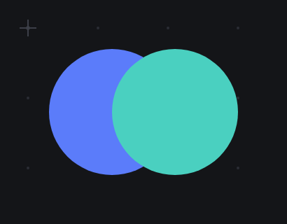
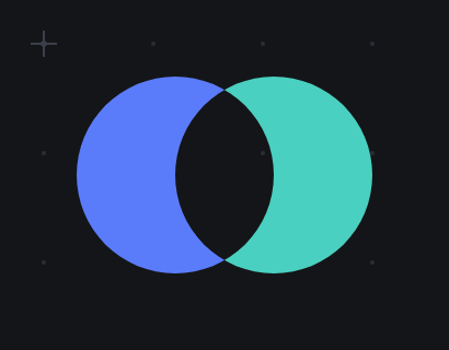
Two circles, and the same two circles after one alt-drag across the
overlap. The lens is gone and what's left is two crescents — neither of which
anybody drew.
That's the whole tool. It sounds like a convenience. It is a different way of
drawing, and I want to explain why, because it took me a long time to notice.
Consider how you'd draw a crescent moon without it. A crescent is a closed curve
with two arcs and two sharp points. So you take the pen, and you place an anchor
at the top point, and you drag out a handle to set the curvature of the outer
arc, and you place another anchor at the bottom point, and you break the handle
so the curve can come back in a different direction, and you drag out a new
handle for the inner arc, and you close the path, and then you spend a while
nudging the handles because the inner arc isn't quite parallel to the outer one.
Every one of those steps required you to already know what a crescent is made of.
You had to decompose the shape in your head — into anchors, into tangents — and
then type the decomposition in. The tool asked you for the answer, and you had to
have it before you started.
Now draw it with Shape Builder. Circle. Second circle, offset. Alt-drag across
the overlap. Crescent.
You didn't decompose anything. You didn't think about anchors or tangents, and
you certainly didn't think about which direction the inner arc's handle points.
You thought about two circles, which is what a crescent actually is, and you let
the geometry work out the rest.
The difference is not speed, although it is faster. The difference is that the
first method requires you to know the answer, and the second one lets you find
it. You can put down four rectangles and a circle without a clear plan, look at
what the overlaps suggest, and carve. That's a search, and the pen doesn't let
you search. The pen makes you commit. [1]
This is why I keep saying it changes how you draw rather than what you can draw.
Anything you can build with Shape Builder, you could in principle have built with
the pen. In principle you could also compute a square root with a pencil. The
question is never what's possible, it's what's cheap, because what's cheap is
what you'll actually try, and what you try is where the good ideas come from.
Make the exploration cheap and you get more exploration. That's most of what a
good tool is.
The name for this in the wider world is boolean geometry — union, intersection,
difference — and it is usually presented as a menu. You select two objects, you
open a panel, you pick "Subtract Front", and you find out whether that was the
one you wanted. If it wasn't, you undo and try "Minus Back". The operation is
correct and the interface is a guessing game, because the thing you want to
manipulate — that face, the one you can see — is not what the menu talks about.
The menu talks about objects and stacking order.
Shape Builder throws away the menu and lets you point at the face. You want that
region? Drag over it. You want it gone? Alt-drag over it. There is no stacking
order to reason about, no dialog to translate your intention into, and no
guessing. The interface is the drawing. [2]
It's mapped to M, and it is the one tool in the toolbar that reliably makes
somebody say "oh" out loud the first time they use it. I have come to trust that
sound more than most of the numbers you can put in a spreadsheet.
[1] Someone will point out that you can edit a bezier after you draw it, and you
can, and that isn't the same thing. Editing a path you already committed to is
repair. Dragging across faces you haven't decided about yet is exploration. The
posture is different, and so is what you end up making.
[2] The generous reading of the menu version is that it was designed when nobody
knew whether the "point at the face you want" interaction could be made to feel
good, and it's genuinely hard: you have to compute all the faces up front, live,
while the cursor moves. That's a real engineering cost, paid once, so that the
guessing game is paid by nobody.
---
# Introducing the Agent API
Published: 2026-06-27
URL: https://www.justdraw.fyi/posts/introducing-the-agent-api/
Here is a question worth being precise about: what would it mean for an AI to use
a design tool?
The usual answer is that it generates an image. You describe a logo, a model
produces a grid of pixels that looks like a logo, and you are now the owner of a
picture you cannot edit. If the circle is four pixels too far left, you cannot
move it four pixels left. There is no circle. There is a field of colour that
resembles one, and your only recourse is to ask again and hope.
That's not using a design tool. That's ordering from a kitchen you're not allowed
into.
Using a design tool would mean the AI places a circle — an actual circle, an
object with a centre and a radius that you can select, move, recolour and delete
afterwards, sitting in a layer, in a document, in your undo history. And that is
what the agent API in justdraw.fyi does.
You paste a project link into a chat with a model. It draws. When it's finished
you open the tab and there is a drawing, made of shapes, and every one of them is
yours to move.
The mechanism is dull, which is the point. Every edit in justdraw.fyi is a JSON
command, and there is one set of them:
```
element.draw element.list element.name
element.move element.style element.delete
element.clone group.create group.ungroup
arrange.align arrange.distribute arrange.order
doc.get doc.export
```
That is the whole vocabulary. When you press Ctrl+G in the editor, the keyboard
sends `group.create`. When you click the group button, the toolbar sends
`group.create`. When you run `jd group create`, the CLI sends `group.create`. When
a language model decides that two shapes belong together, it sends
`group.create`. Four seats, one steering wheel.
To send one, you POST it:
```sh
curl -sX POST https://app.justdraw.fyi/api/v1/agent \
-H 'Content-Type: application/json' \
-H 'Origin: https://app.justdraw.fyi' \
-d '{"cmd":"element.draw","project":"0192a4e1-…",
"args":{"shape":"rect","x1":0,"y1":0,"x2":40,"y2":30,"fill":"#5b7cfa"}}'
```
and you get back `{"ok":true,"result":{"id":"…","type":"rect","name":"Rectangle
1"}}`. Every command that creates something returns its id, and that id is the
argument to the next command. It's the same bargain the command line makes,
because it is the same protocol underneath. [1]
Two things about that call are worth explaining, because they are the two things
that will bite you.
The `Origin` header is required. Leave it out and you get a 403. It's a cross-site
guard — a browser will not attach that header when some other website tries to
POST to us on your behalf, which is the attack it exists to stop, and `curl`
doesn't send one unless you say so. This is the kind of detail that is obvious to
the person who wrote the middleware and invisible to everyone else, and I only
learned how invisible by watching an AI copy my own example, get a 403, and
conclude the API was broken. [2]
And the drawing commands need the project open in a browser. With no tab, you get
a 409. The editor in the browser is the engine — it owns the geometry, the layers,
the undo stack — and the server only relays commands down the WebSocket the editor
is holding open. That is a real constraint and I defend it at length in the next
post. The commands that only read (`element.list`, `doc.export`) work either way,
because those come out of the database.
Now the part that took the longest and is the least technically interesting,
which is how an agent is supposed to learn any of this.
It can't, from the above. A model that receives a bare URL knows nothing about
justdraw.fyi. It has never heard of `element.draw`. It has no reason to think the
canvas is dark, or that shapes come out grey, or that this API even exists.
So the URL teaches. `GET /p/.md` returns a briefing generated from the live
project. Not a link to documentation — a document about *this drawing*, written at
the moment it was requested. It says what is currently on the canvas, with real
ids in a real table. It gives the whole command vocabulary. It prints `curl`
examples with this project's id already substituted in, so they can be run as
written, with the `Origin` header already there. It tells you whether an editor is
open right now, and therefore whether a drawing command will work or 409. And it
ends with a list of things that will otherwise cost you a retry — that the canvas
is `#141518` and a black shape drawn on it is invisible, that everything starts
grey until you colour it, that y grows downwards, that `align` needs two elements
and `distribute` needs three.
The same essentials are also in the editor's HTML, in a visually hidden section,
because an agent that fetches the pasted link as a web page and converts it to
Markdown would otherwise see nothing but a canvas element. [3]
Every line in that briefing is there because a real agent got that exact thing
wrong. I sat and watched them do it. That process — handing the link to a model
that knew nothing, watching it fail, and treating each failure as a bug in my
documentation rather than a defect in the model — turned out to be the most
useful thing I did on this project, and it is the subject of a post of its own.
The thing I did not anticipate is how much better the drawings get when the agent
is drawing shapes instead of pixels. When it's wrong, it's wrong in a way you can
fix. The rectangle is four pixels left. You drag it four pixels right. There is a
rectangle to drag.
[1] There's a separate rate limit on `/api/v1/agent`, higher than the one on
ordinary page traffic, because a scripted drawing is a burst of dozens of tiny
commands and the general limit — sized for humans loading pages — would stall it
halfway through a logo.
[2] There is now a test in the repo that executes the exact `curl` command the
briefing prints, through the real middleware stack, and fails if it doesn't
return 200. A copy-pasteable example that 403s is worse than no example at all.
[3] It must not be `display:none` or `[hidden]`, because the converters drop those.
It has to be visually hidden but present. This is a small, stupid, load-bearing
detail, and I offer it freely to anyone else writing for an audience of machines.
---
# Introducing jd, the Command Line
Published: 2026-06-23
URL: https://www.justdraw.fyi/posts/introducing-the-command-line/
What happened to all the software that let you script it?
There was a stretch, roughly the 1990s, when this was table stakes. Photoshop had
actions. Illustrator had scripting. Every serious Mac application shipped an
AppleScript dictionary, and Excel had a macro recorder that would write the macro
by watching you work. The idea was uncontroversial: a program is a set of verbs,
and if a human can invoke them, a script should be able to invoke them too.
Then, mostly, it stopped. Not all at once, and not by decree. The applications
moved to the browser, and the browser was a place where the application ran but
nothing else did, and the scripting layer quietly became an HTTP API maintained by
a different team, exposing a different subset of the verbs, on a different
release cycle. Which is a polite way of saying it drifted, and then it rotted,
and then it got deprecated.
I wanted the 1990s bargain back, so justdraw.fyi has a command line. It's called
`jd`, and here is what using it looks like.
```
$ jd proj create logo
0192a4e1-7c33-7f21-9b0e-2f1a6c9d8e40
$ jd draw 0192a4e1 rect 0 0 120 80
0192a4e2-118f-7c04-a6d3-9e7b2c115a03
$ jd draw 0192a4e1 circle 60 40 25
0192a4e3-9a20-7be1-8c47-51d0f3ab7726
$ jd style 0192a4e3 fill=#5b7cfa
ok
$ jd group create 0192a4e2 0192a4e3
0192a4e4-4d78-7a55-b2f9-08c31e6b7d92
```
Look at what every command does when it finishes: it prints the id of the thing
it just made, on stdout, by itself. That is the entire design. `jd draw` prints
an id, and that id is the argument to `jd style`, and both of those ids are the
arguments to `jd group create`, which prints another id you can hand to `jd
align`.
This is not a novel idea. It is the oldest idea in Unix, and the reason a
shell pipeline works at all: each thing emits a name for what it produced, in a
form the next thing can eat. Everything that survived from that era survived
because it did this. The programs that printed a friendly summary — "Successfully
created your rectangle!" — did not compose with anything, and are gone.
So `jd list` prints one element per line, id first. Ids are opaque UUIDv7s, and
you are meant to pass them around, never to parse them. [1]
The other decision worth defending is that an element id works anywhere a project
id is expected. When you type `jd style 0192a4e3 fill=#5b7cfa`, you have not told
the system which project that shape lives in, and you shouldn't have to. The
shape knows. The server looks it up. A group id works anywhere an element id
does, for the same reason: the thing you are holding should be sufficient to
identify itself, and making the human carry a second identifier around so the
computer doesn't have to do a lookup is exactly backwards.
The verbs are the ones you'd guess. `draw` takes line, rect, square, ellipse,
circle, triangle, polygon, star and text. `move`, `clone`, `delete`, `name`,
`style`. `group create` and `group ungroup`. `align` in six directions,
`distribute` horizontally or vertically, `order` to push things front and back.
`proj create`, `list`, `show`, `rename`, `destroy`. And `export`, which writes
the drawing out as YAML or SVG.
Now the honest part, which is the constraint that surprises everybody.
The drawing commands require the project to be open in a browser. If no tab is
open on that project, `jd draw` will tell you so and exit 1.
That sounds like a bug. It's the central design decision of the whole system, and
I'll defend it properly in the next post, but the short version is this: the
editor in the browser already knows what "align these three shapes" means. It has
the geometry, the layers, the groups, the undo stack, the renderer. If the CLI
were to compute alignment on the server, there would be two implementations of
alignment, they would disagree, and the day they disagreed would be the day a
customer found out. So `jd` doesn't compute anything. It sends a command, the
server relays it down the WebSocket the editor is holding open, the editor does
what it does when you press the align button, and the answer comes back.
Which means that when you run `jd style … fill=#5b7cfa`, someone watching that
tab sees the circle turn blue. Your terminal and their screen are the same
session. The edit lands in their undo history. It autosaves like anything else.
The commands that don't touch the drawing don't need a tab, because they're
answered from the database: `proj create`, `list`, `show`, `rename`, `destroy`,
and export. You can mint a project and dump its contents to YAML from a cron job
at three in the morning with no browser anywhere in the world. [2]
That's the trade. A CLI that needs an open tab is a strange thing to ship, and I
have thought about it more than any other decision in this project. But the
alternative was a second implementation of a vector editor, written in Go,
slightly wrong, drifting a little further from the real one every month — which is
precisely the fate that befell every scripting layer I mentioned at the top of
this post.
I would rather have one editor and an unusual constraint than two editors and an
ordinary lie.
[1] UUIDv7s happen to sort by creation time, which is handy, and it is still true
that nothing in the system is allowed to depend on it. The moment a program parses
meaning out of an id, the id has stopped being an id.
[2] `jd export drawing.svg` at 3 a.m. is, in fact, the thing that made
me build export first.
---
# Introducing the Editor
Published: 2026-06-19
URL: https://www.justdraw.fyi/posts/introducing-the-editor/
When I tell people justdraw.fyi has no account and nothing to install, the next
thing they say is some polite version of: so it's a toy.
It's a fair inference. Almost everything that opens instantly in a browser tab
with no sign-in is a toy, because the things that aren't toys are the things
somebody spent years on, and the people who spend years on something want to know
who you are. So the absence of a login has become a reliable signal of the
absence of depth.
I'd like to break that correlation, and the only honest way to do it is to
describe the tool.
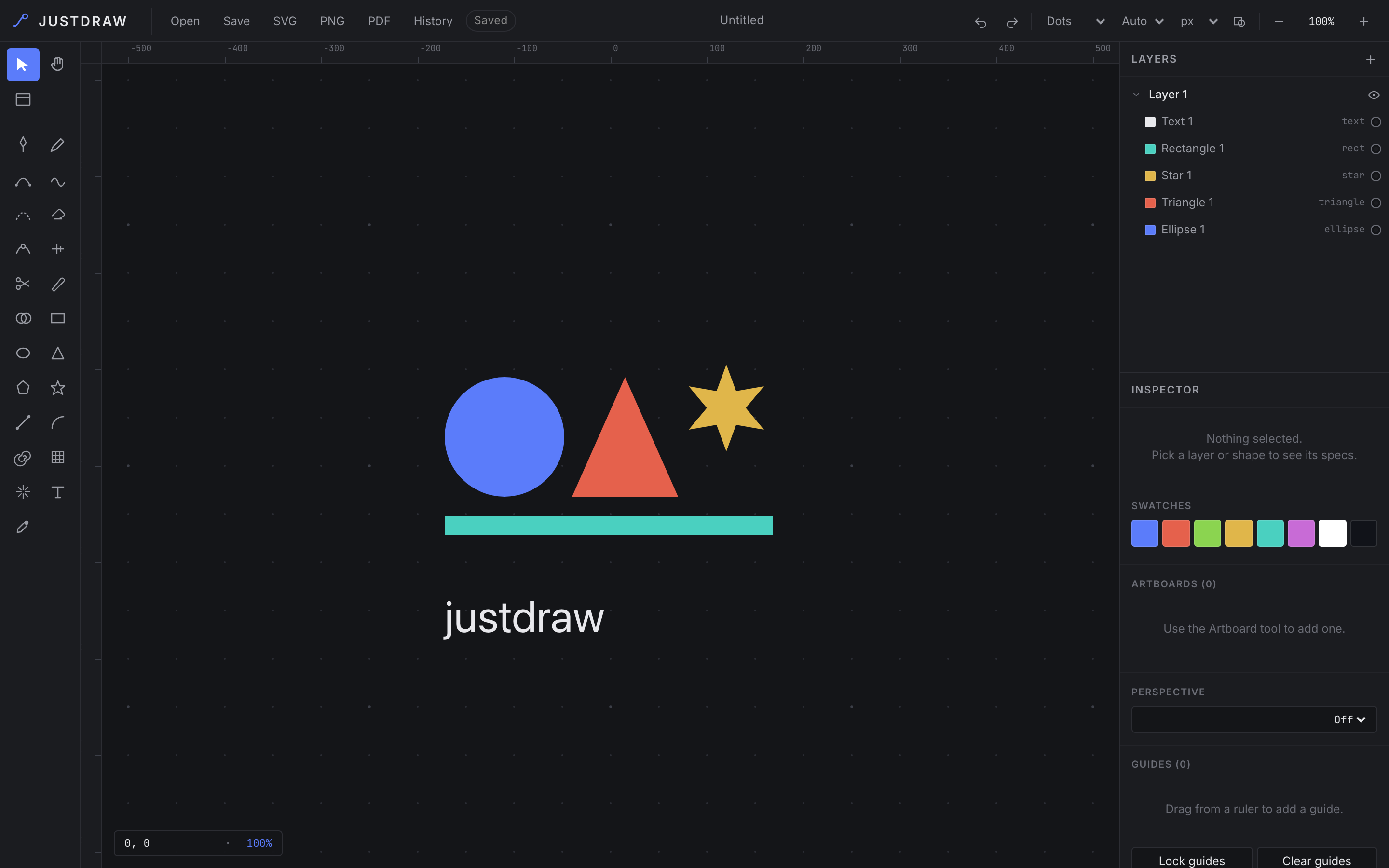
The whole thing. Tools down the left, layers and inspector down the
right, an infinite dark canvas in the middle. It opens in a tab, in about the
time it takes to read this caption.
Start with the pen. Not a line tool — a bezier pen, with control handles you can
break, so a curve can come into a point and leave it in a different direction.
That is the primitive that separates vector drawing from shape-dragging, and it
is the thing that is missing from every browser toy I have ever opened. Next to
it is a pencil for freehand, a curvature tool that lets you place a smooth curve
by clicking through the points you want it to pass, and a smooth tool you drag
along a path you already drew to relax it.
Then the shapes, which are the boring part and are all present: rectangle,
ellipse, triangle, polygon, star, line, arc, spiral, a rectangular or polar grid,
and a starburst flare. Each is one keystroke away, because a tool you reach for
fifty times an hour should cost one key and not a trip to a menu. [1]
Now the part I actually want to talk about, which is the tools that don't create
geometry but change it.
Scissors splits a path at a point you click. Knife slices across everything you
drag it through. The path eraser trims along a path rather than deleting it.
Reshape rubber-bands a region of a path — not a single anchor, a region — and
moves the whole region as one, which is how you fix a curve that is wrong in the
middle instead of wrong at a point. Width gives a stroke a variable weight, thick
here, thin there, the way an actual ink line behaves when a hand presses into it.
And then there is Shape Builder, which is the reason I use this thing.
Draw two overlapping circles. Their overlap is a lens shape that does not exist
as an object anywhere in the document; it's an accident of two other objects
sitting on top of each other. With Shape Builder you drag across that lens and it
becomes real — one shape, on its own, with its own fill. Alt-drag across a face
and it's gone, subtracted out.
This sounds like a small thing. It changes how you draw. Without it, you draw a
complicated silhouette by placing anchors along its outline, one by one,
correctly, from imagination. With it, you draw three overlapping rectangles and a
circle and then wipe away the parts you don't want, the way you'd carve. The
first method requires you to know the answer before you start. The second lets
you find it. Almost nobody who has used a boolean shape builder goes back, and it
is why "vector editor in a browser tab" and "toy" don't have to be the same
sentence. [2]
Around all of that sit the things that make a drawing a document rather than a
picture: layers, groups, artboards that define export regions, a palette of
swatches that belongs to the document, undo and redo, a grid you can size and
restyle, display units, version history, and an outline view for when the fills
are lying to you about what the geometry is really doing.
Two decisions in the editor are worth explaining, because they look like taste
and they are not.
The canvas is infinite. A page is a printing constraint, and I am not printing.
Shapes go where you put them, negative coordinates are fine, you pan and you keep
going. If you want a page, you make an artboard, and the page becomes a thing you
chose rather than a wall you were born inside.
And everything you draw starts the same flat grey — `#202128`, on a canvas that
is `#141518`. That is deliberate, and people find it strange for about a minute.
A new shape is not a decision about colour. A tool that picks a colour for you is
a tool you now have to argue with, and the argument costs more than the choice.
So the geometry arrives uncoloured, and the swatches are sitting right there for
the moment you actually mean something by red.
The dark canvas is the same principle pointed at the interface. The artwork
should be the brightest thing on the screen; every panel around it is a grey
chosen to sit behind your drawing rather than compete with it. Look at any tool
people use for eight hours a day and you will find someone made that decision
too. The interface is supposed to recede.
One last thing, and it's the reason any of this loads before you lose interest.
The editor is plain ES modules. The browser fetches `main.js` and that is the
entire story: no bundler, no framework, no build step, no hydration, no
multi-megabyte payload spinning up your fans before the first rectangle appears.
That isn't asceticism. It's the same principle as the missing login, applied one
layer down. Everything you put between the click and the canvas is something that
can be slow, can break, and can fail on somebody's corporate network in a way you
will never reproduce.
The document autosaves while you work, and you can pull it out whenever you like:
the Save button hands you the drawing as YAML you can read with your own eyes,
and SVG, PNG and PDF do what they say.
That's the tool. It's the same tool a command line drives, and the same tool an AI
agent drives, which are the next two posts. But it had to be good on its own
first. A protocol on top of a weak editor is just a faster way to make a weak
drawing.
[1] V for select, H for hand, P pen, B pencil, R rectangle, O ellipse, T
triangle, Y polygon, S star, L line, M shape builder, G toggles the grid.
[2] It is also the tool that most reliably makes someone say "oh" out loud the
first time they use it, which is a metric I have come to trust more than most of
the ones you can put in a spreadsheet.
---
# Introducing justdraw.fyi
Published: 2026-06-15
URL: https://www.justdraw.fyi/posts/introducing-justdraw-fyi/
How much ceremony should it take to draw a box and an arrow?
It's a real question, and I don't think the people building drawing tools have
asked it lately. You can tell from the way they talk about their products. They
talk about workspaces and teams and real-time multiplayer presence, and none of
that is bad, but none of it is a box or an arrow.
Try it and count. I did. I opened a well-known design tool to draw one rectangle
with one line coming out of it, the kind of thing you sketch on a napkin in four
seconds, and I counted what stood between me and the canvas. A sign-in. A
password manager prompt. A question about which team the file belonged to. A
question about whether this was a design file or a whiteboard file. An invitation
to invite my colleagues. A tour of a feature I hadn't asked about. Then a
loading spinner, and then, finally, a canvas.
Nine interactions and about forty seconds, to reach a surface where I could spend
four seconds doing the thing I came to do. [1]
That ratio is the whole reason this exists. justdraw.fyi is a vector editor where
you press one button and you are on the canvas. There is no account. There is
nothing to install. You click New project, you get a URL like
`app.justdraw.fyi/p/0192a4e1-…`, and the drawing is at that URL. To show it to
someone, you send them the link. They open it and they can draw too.
The link isn't a pointer to the drawing. The link is the drawing.
I want to be careful here, because the obvious objection to a tool with no login
is that it must be a toy, and the obvious defense is to list features, and a list
of features is not an argument. So let me make the argument instead.
The reason drawing tools accumulate ceremony is not that their makers are foolish.
It's that every step in the accumulation is locally correct. Someone needs to
share a file with one colleague but not another, so you build permissions.
Permissions are meaningless without knowing who somebody is, so you build
identity, which is a login. Identity is useless without a place to put the
things a person owns, so you build a workspace. A workspace is confusing on
first sight, so you build an onboarding flow to explain it. And now the user who
wanted a box and an arrow signs in, picks a team, and reads a tooltip.
Follow the chain backwards and notice what happened. The user with the most
demanding requirement — granular permissions — set the floor for the user with
the least demanding one. That is the default outcome in software, and it is
almost never chosen deliberately. It just happens, one defensible decision at a
time.
So I broke the first link. There is no login. Because there's no login, there are
no permissions. Because there are no permissions, there's no workspace. Because
there's no workspace, there's nothing to onboard you into, and the button on the
landing page can go straight to a canvas.
The cost of that is exact, and I'd rather state it than have you discover it.
Anyone holding the link can edit the drawing. The UUID is the password. It's 128
bits of randomness, so nobody is going to guess it, and nobody who doesn't have
it can find your drawing. But if you paste the link into a public Slack channel,
you have handed that channel an editable copy. [2]
For a box and an arrow, that's the right trade, and I'll take it every time. For
your unannounced acquisition roadmap, it isn't, and you should use something
with a login, because a login is precisely what you need. I would rather be
honestly narrow than dishonestly general.
Now the part I didn't plan.
Once a drawing is a URL with nothing in front of it, you can give that URL to an
AI agent, and the agent can draw in it. Not generate a picture of a drawing —
draw. Put a rectangle at these coordinates. Group those three shapes. Align the
group against the wordmark. Fill it with `#5b7cfa`.
That works for a reason that has nothing to do with AI. Every edit in justdraw.fyi
is a JSON command, and every source of edits sends the same one. When you press
Ctrl+G, the keyboard sends `group.create`. When you click the group button, the
toolbar sends `group.create`. When you run `jd group create` in a shell, it sends
`group.create`. When a language model decides two shapes belong together, it
sends `group.create`. There is exactly one implementation of what grouping means,
and everything in the system is a customer of it.
So an agent's edit goes into your undo history. It appears on your screen while
it happens. It saves the way your own edits save. It isn't a separate API bolted
to the side of the product, drifting quietly out of sync with the product, which
is what a separate API always does. It's the same tool, driven from a different
seat.
And the URL teaches. Fetch `/p/.md` and you get a briefing generated from
the live project: what is currently on the canvas, every command that exists, and
example calls with this project's id already filled in. An agent that has never
heard of any of this can be handed a link and get to work, which I know because
I've spent a fair amount of time handing links to agents and watching them fail
in ways I hadn't anticipated. That turned out to be the most useful thing I did,
and it's a post of its own.
There are more of those coming: what's actually in the editor, why the browser is
the engine and the server is only a relay, why the document is plain text you can
read, and what six different AI agents got wrong before I fixed the documentation
instead of blaming them.
For now, the button. It's one click, and the clock starts on the canvas.
[1] Forty seconds is not a hardship. I'm not claiming injury. I'm claiming that
the ratio of ceremony to work tells you what a tool is *for*, and forty-to-four
tells you that tool is not for a box and an arrow. It's for something else, and
it's probably very good at that something else.
[2] There's a version of this product with accounts, private drawings, and a
sharing model, and it would be a better business. It would also be a different
product, and it would have to explain itself.
---
# Hello, world
Published: 2025-01-01
URL: https://www.justdraw.fyi/posts/hello-world/
This is the first post on **justdraw.fyi**.
Write new posts by dropping a Markdown file into `web/content/posts/`, then
rebuild and deploy (`make deploy`). Each post is rendered by Hugo and embedded
into the binary at build time.
---